


PIXELATE is a microXRF visualization and analysis tool built for NASA JPL’s Mars 2020 rover PIXL instrument team. The tool is built to enable the team’s search for signs of past life on Mars, as well as to explore the red planet’s geologic history.
Adrian Galvin [design], David Schurman [CS], Pooja Nair [design]
10 week project.
We were approached by the Planetary Instrument for X-ray Lithochemistry team at NASA JPL to create a novel visualization interface for the data stream that they will receive from their instrument once the Mars 2020 rover lands. This software enables them to comprehend the geologic history of Mars by visualizing the spatial distribution and relationships between elements and mineral compounds at scan sites.
Certain geologic processes can only occur in the presence of living things, and PIXL is sensitive enough to find evidence of these geologic processes. However, parsing the data to find the key relationships between elements is a non-trivial task. Our visualization engine provides a solution for this problem, and enables novel pathways of scientific reasoning.


The Mission
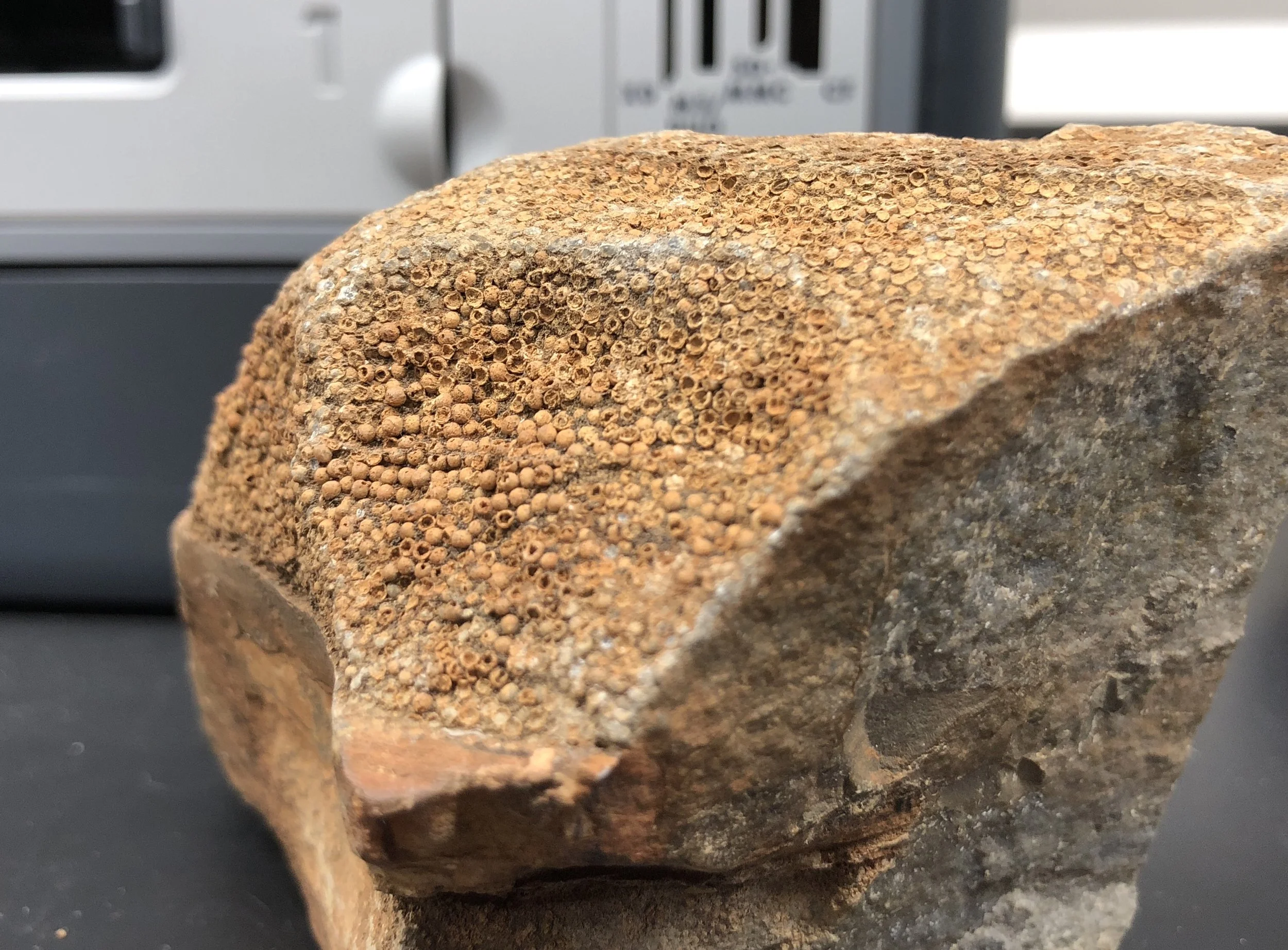
PIXL is a sensor aboard the Mars 2020 rover, which is designed to analyze the elemental composition and distribution of rock and soil samples. It uses Micro X-ray Fluorescence Spectroscopy (MicroXRF), which involves exciting normally-stable atoms within each sample using a fine X-ray beam. Excited atoms then emit X-rays at an energy level characteristic to that particular element, allowing for precise determination of elemental composition following some post-processing.
PIXL is unique among XRF instruments that have flown to Mars because of its ability to focus its beam to a very narrow diameter while still maintaining a high X-ray flux. In practice this means that it can return much more detailed, high resolution element maps, which can potentially enable scientists to investigate extremely small geologic features.

The Problem
PIXL produces a grid of point scans, which contain a measurement of the concentration of each element at each grid point location. But it is the relationship between the distribution of all of the present elements which tells the scientist the critical information that they need to know. Standard visualization techniques of small multiples comparison and opacity overlay are unable to effectively address complex co-variance and dis-variance of many elements. In addition, each scientist on the PIXL team is doing significantly different work, and each sample presents a unique visualization challenge.
Our mission was to design a tool which could visualize the spatial relationships and concentrations of elements in Martian rock samples in order to enable the search for signs of past life on the red planet.


Orientation: Exploratory Interviews
To understand the needs of the PIXL team, we had to dive into several overlapping fields of science. PIXL is an X-ray instrument, which studies the chemical composition of geologic specimens, in order to make discoveries about biological specimens from other planets. There was a lot to get up to speed on before we could start the design process.
The PIXL scientists described how they currently use visualization, which falls into two main categories: small multiples comparison and opacity based overlays.


Science Concepts
The PIXL team faces an enormous amount of challenges across multiple fields of science over a two year mission preparation timeline. Sorting through all of this information to target the key challenges that we should address through visualization started with boundary object sketching and a workflow timeline map. Using these documents as reflections of what we had heard and learned helped the science team direct us to the most important areas of opportunity and pain points.


Contextual Inquiry: Instrument Lab
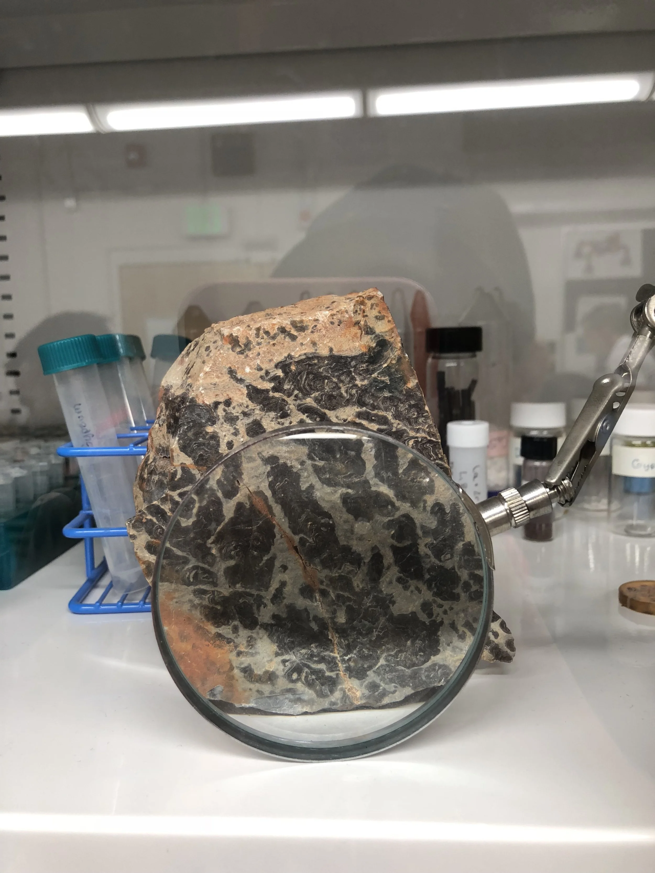
In order to fully understand the team’s use cases and paint points, we had to study them in their work environment. We watched the team take microXRF scans of geologic samples to understand what software, data types, and pipelines our software would have to work with. Operating PIXL requires a small ecosystem of specialized software to capture, record, quantify and model the scan. We had to get a tight handle on how this process worked in order to know exactly how our visualization engine should behave.
Bonus: we got to hold one of the oldest known rock samples on Earth!


Contextual Inquiry: Science Workflow
The PIXL team uses several different types of visualization software, each of which has strong and weak points, and each scientist uses each tool a little differently. They’ve never had a tool purpose built for them, so we had to painstakingly observe each scientists workflow with their tools to start to extract common use cases and pain points.
The PIXL scientists are world leaders in their field of investigation. It can be challenging for someone with such deep knowledge to articulate how they do what they do verbally because mastery by definition requires people to integrate knowledge so well that they don’t have to think about it. Performing think aloud workflow demonstrations allowed us to see more clearly into how they think and work. They were able to articulate their needs through their familiar daily actions and investigations.


Ideation
The PIXL team articulated 3 high level categories of interaction:
Small multiples comparison (to explore the whole sample)
Opacity overlays (to explore spatial co-variation)
Tactical decision making (to support rover science activity planning)
We sketched out interfaces that supported all of these needs in order to clarify what we would need to build for prototype testing.

Testing
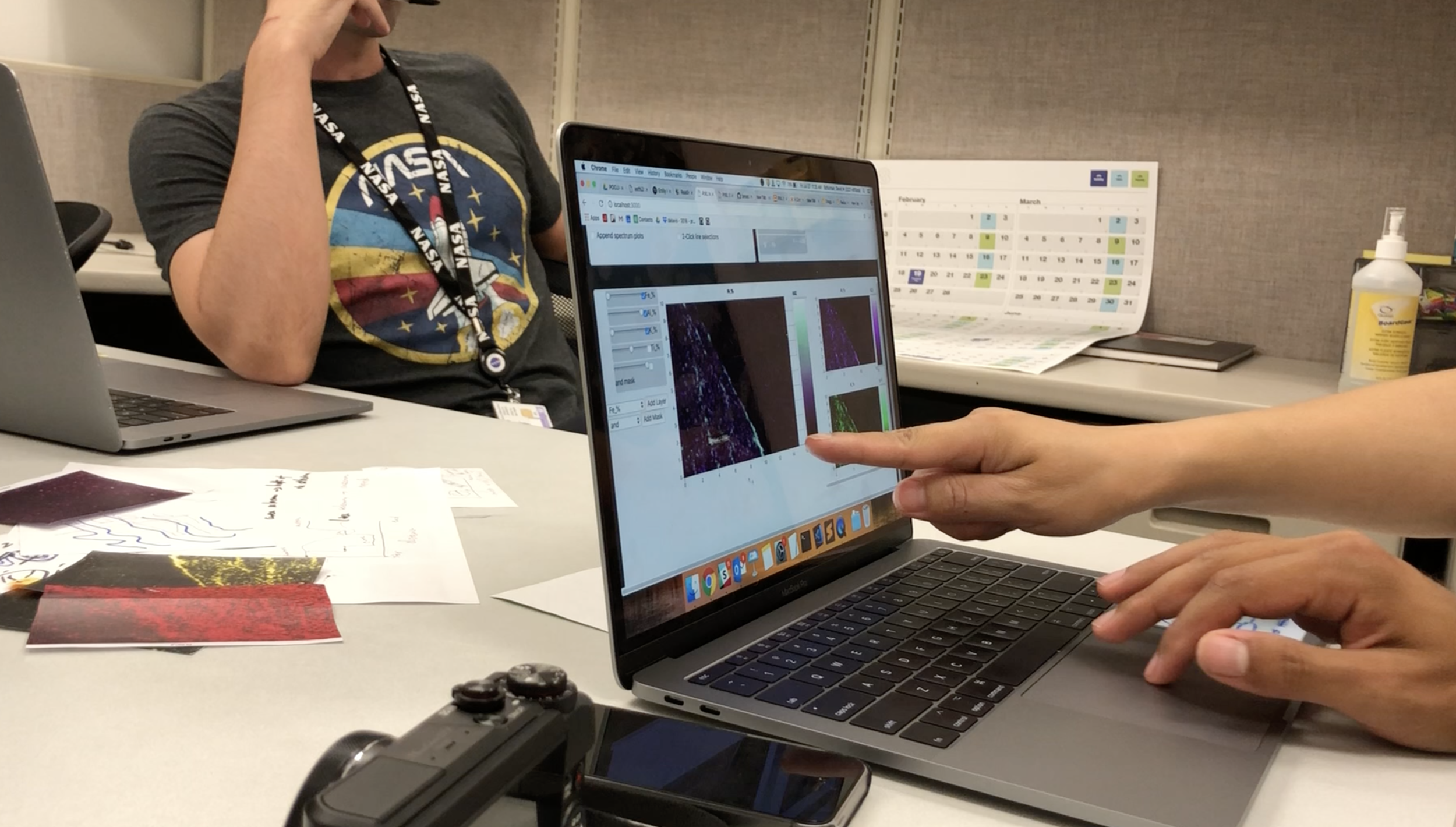
Once we understood the problem, pain points, and workflows, we were able to build and test prototypes. Prototyping for scientific visualization software presents unique challenges for designers. When prototyping for consumer apps, design tools such as framer, origami studio, protopie and kite compositor provide more than enough fidelity and capability to convey the look, feel and behavior of a design. But when prototyping for visualization, you must use the real data in the prototype. And the representation must be dynamic. The user centered design team at the Jet Propulsion Lab uses a specialized prototyping technique called hybrid or mixed fidelity prototyping.
David created a functioning prototype which produced visualizations and made the visual adjustments that we knew the team needed most. Pooja and I then built a paper/digital hybrid UI which the scientists could use to control David’s back end system. This process revealed some incorrect assumptions that we had made.
Our understanding that the scientists performed two major types of investigation: comparison and overlay was incorrect.


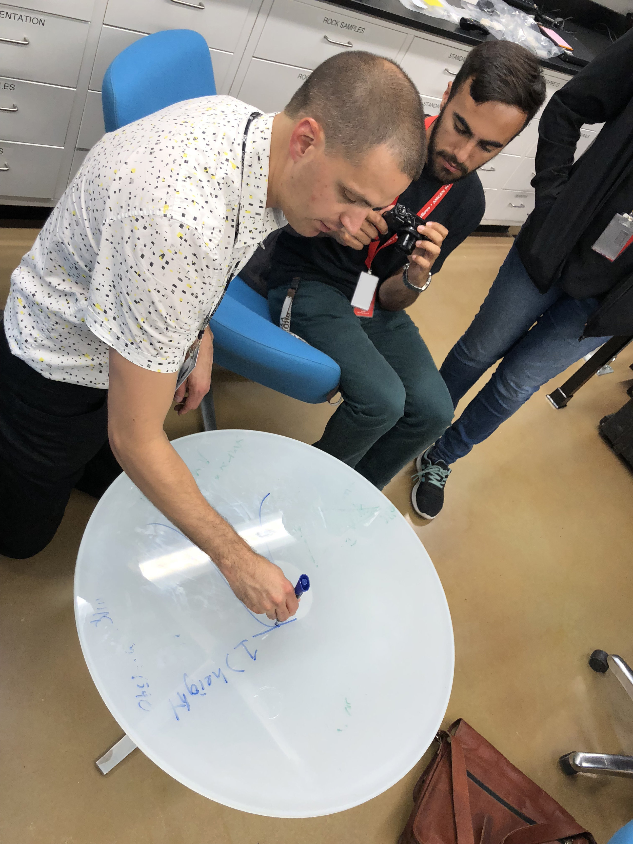
Co-design
To adapt to this new situation, we shifted our mindset from one of testing, to one of co design. We broke out the markers, stickies and even used photoshop to hack some visual solutions on the fly. The scientists helped us to gain a much more nuanced understanding of their workflow which they had been unable to articulate before.


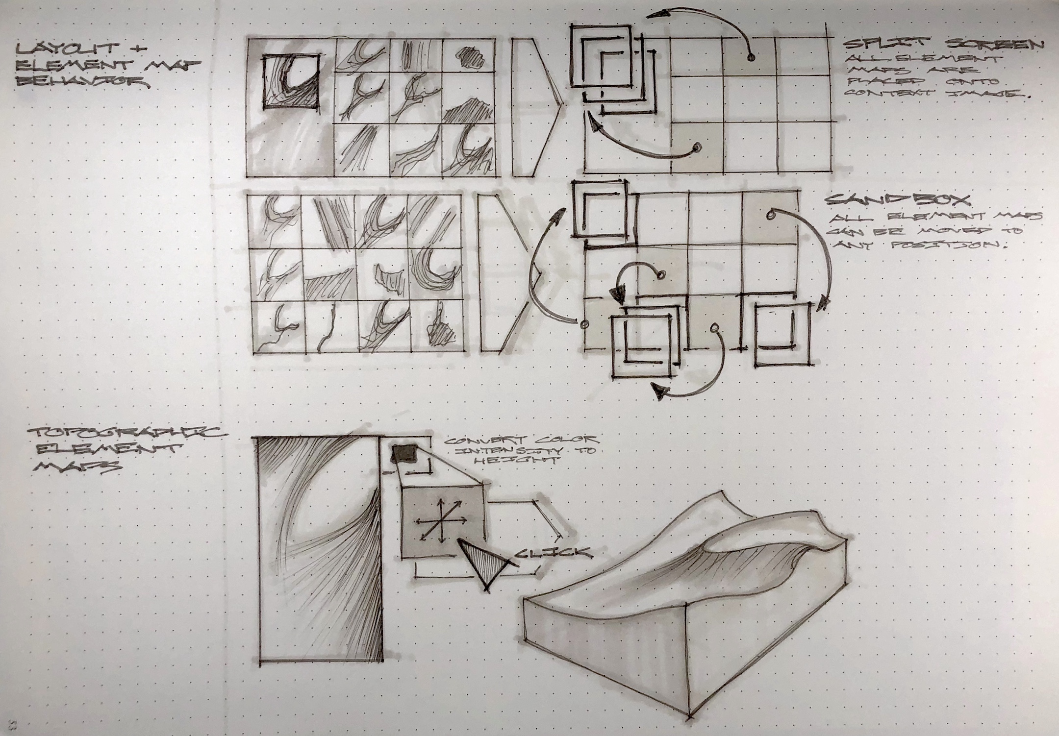
Reasoning by Co-location as Opposed to Dis-Variance
We came to understand that the science team’s thinking had been limited by the visualization tools that they currently used. When overlaying two element maps using two different colors, what is clarified is the areas where only one element is located. However, this is not the most scientifically relevant information.
What the scientists really wanted to understand was which elements were located together, and therefore were likely to be part of a mineral formation.
Armed with this insight, we were able to design a new set of visualizations which allows the science team to reason more fluidly and flexibly about the PIXL scans.

A life Beyond Our Work
One of most rewarding experiences as a designer is to see your work carried forward, for it to have continuing positive impact on people. The PIXL team has worked to get funding to build an even more capable version of the software that we built for them.
Thank you
PIXL science team, David and Pooja, the JPL/ArtCenter/CalTech mentor team.
Photo credit : Caltech-JPL-Art Center Visualization Program / Mars 2020 Planetary Instrument for X-ray Lithochemistry (PIXL)